8 Proven Elements for a Winning Ecommerce Buy Box
(AKA, The Most Important Part of Your Shopify Store)
8 Proven Elements for a
Winning Ecommerce Buy Box
(AKA, The Most Important Part of Your Shopify Store)
Want a Shopify product page that actually converts? Swipe the buy box from my $175 million brand. These insights are taken from years of hard work, 100s of split tests & millions in ad spend running traffic to my offers.
Are you frustrated that your Shopify product pages aren’t converting? Grrrr.
Well, before you go pay thousands of dollars to get them redone by professional designers and developers, let me help.
I'm Ezra Firestone — a leading ecommerce expert and the founder of a $175 million Shopify store.
I’ve been optimizing product pages for years, and when one doesn’t convert, the biggest problem is almost always the buy box.
What the heck is a buy box, and why is it so important for your Shopify store? I’ll explain.
(If you're interested in small changes that can have a huge impact on your bottom line, then this article is definitely for you!)
What’s a “Buy Box” & Why is it So Important For Your Shopify Store?
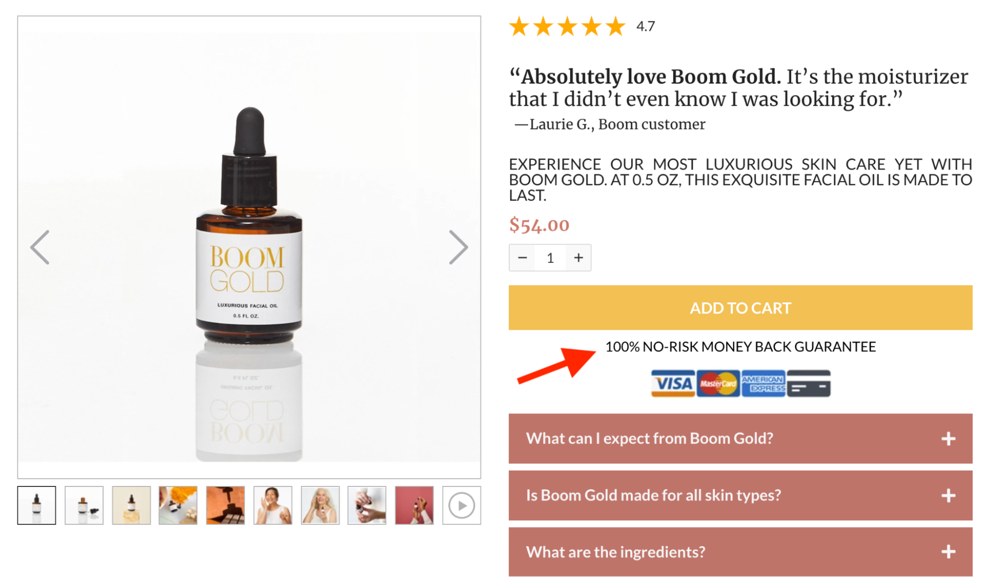
The buy box is the part of your page – usually near the top – where the people can actually buy your product. It looks like this.
Want to hear an incredible statistic?
50% of site visitors never scroll beyond the buy box, which means it’s the single most important part of the page when it comes to attracting customer attention and generating conversions.
Unfortunately, most stores have a super underdeveloped buy box.
That means customers who land on the page are underwhelmed by what they see and leave without adding to cart or even scrolling to see all the great content farther down the page.
But here's the good news: you're only a few small tweaks away from having a killer buy box that drives more sales for your store.
In this article, I share the 8 proven elements behind my winning ecommerce buy box.
These insights come from years of hard work, hundreds of split tests and millions in ad spend running traffic to my offers.
8 Proven Elements Behind My Winning Buy Box
(NOTE: If you see any of these tips and say “My Shopify theme can’t do that!”, don’t worry. I’m going to tell you about a landing page and sales funnel builder you can use to copy all this functionality without a designer or developer.)
BUY BOX ELEMENT #1
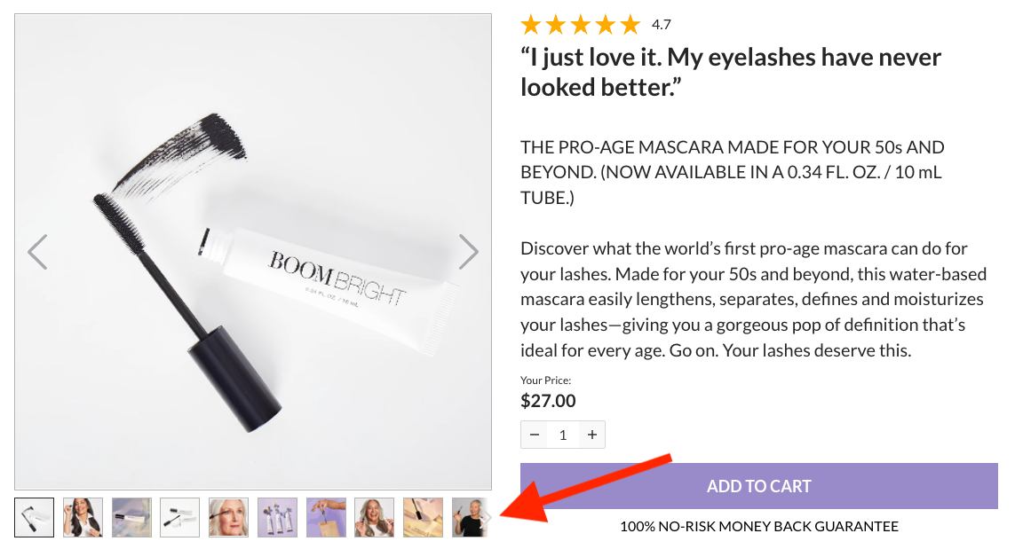
Image Carousel with At Least 9 “Looks”
Let’s start with one of the most important parts of your buy box — the image carousel.
Online shoppers can’t physically interact with your product to see if they like it, so it’s up to your carousel to recreate that experience for them.
To do that, you want to have at least 9 “looks” — i.e., showing your product from different angles and in different contexts (up close, from afar, from different sides, in use, on its own).
When choosing your looks, know that every picture should build desire for your product. Here are 3 ways to get your customers hyped to buy.
2. Answer Questions
If it’s at all unclear how your product works, this is your opportunity to elaborate. Consider including images that highlight features that make your item unique and desirable.
3. Demonstrate Ownership Benefit
Show your customer how their life will improve once they purchase your product. The best way to do that is to show your product in use by your ideal avatar.
See how Booster Boards uses this image to dramatize a specific benefit of buying their product (that it can go up hills)?
Other Tips for Image Carousel
- Use a variety of formats. We recommend 7 images, 1 video and 1 GIF.
- Make sure your images are optimized for all devices — desktop, tablet and mobile.
BUY BOX ELEMENT #2
Multiple Forms of Social Proof
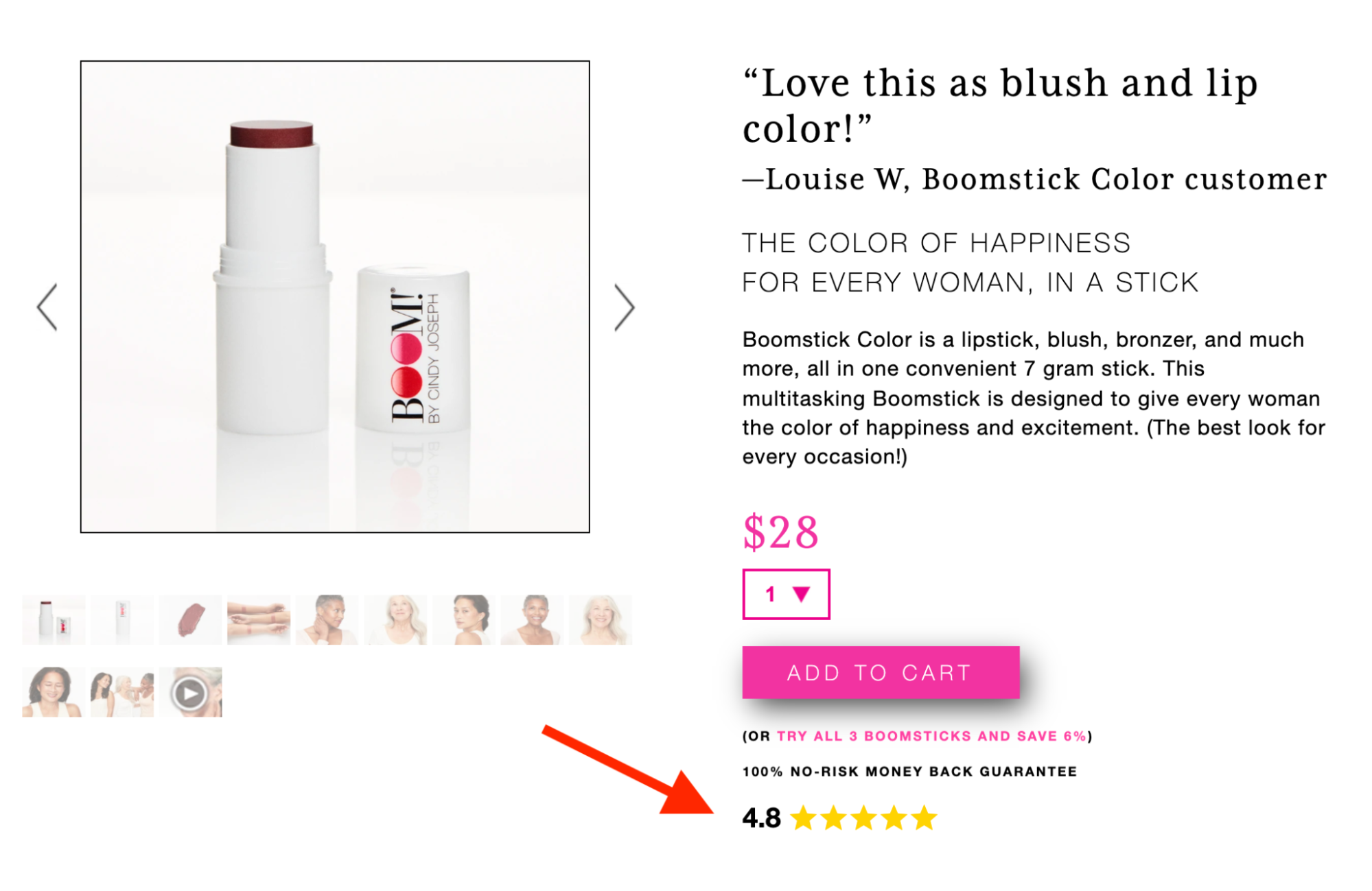
Of course you think your product is great — buyers want to know that other people think your product is great, especially people they identify with. That’s where social proof comes in.
Social proof is one of the most powerful tools you can use to influence a customer to buy your product.
And if you’re thinking “Perfect! I have my reviews section at the bottom of the page,” then I have some bad news for you: that’s not good enough. You want customers to see social proof right when they land on the page.
We leverage social proof in our buy box in 2 ways:
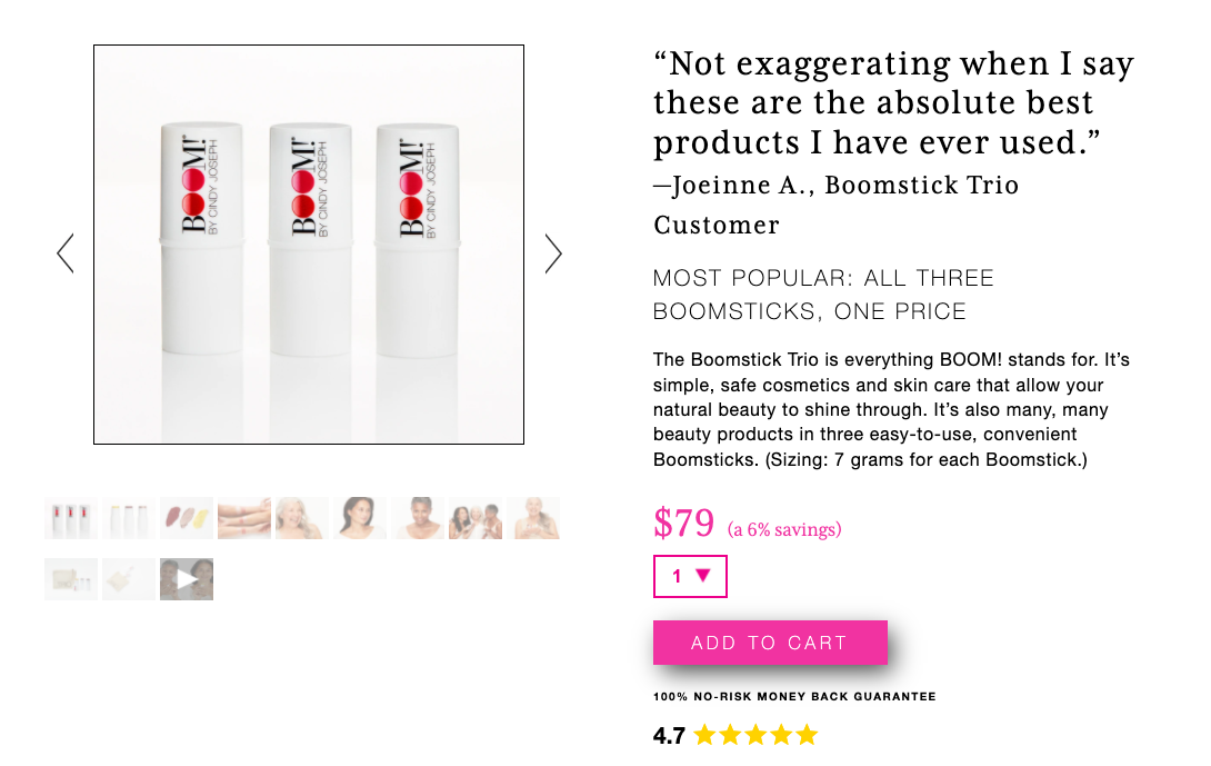
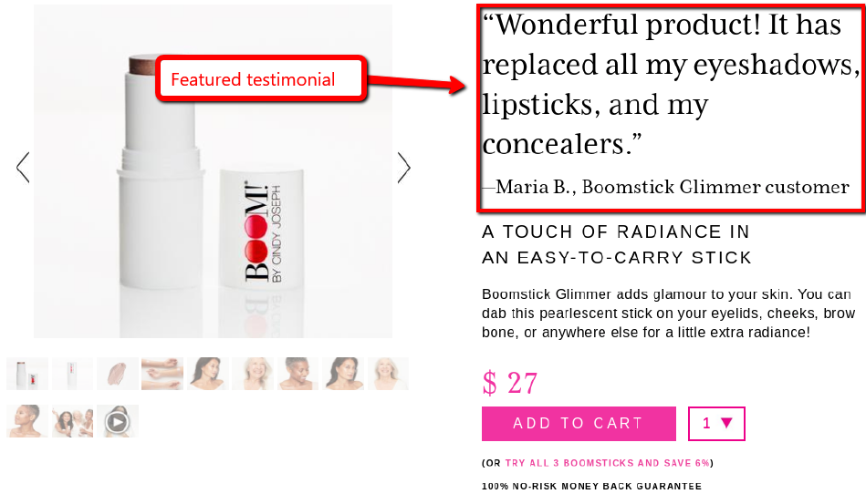
2. Open the Buy Box With a Testimonial
This is one of the most valuable tips in this entire article.
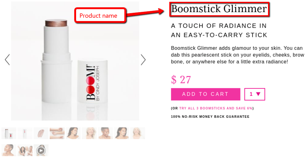
Most people open their buy box with the product name, but here’s the thing — the customer already knows what the product is! This is the most valuable real estate on the entire page, and you’re wasting it on a headline that has no sales impact.
Want an easy way to run split tests?
You don't need fancy, expensive software to run split tests on your Shopify product pages.
If you use my landing page builder Zipify Pages, we have split testing built into the app to make it easy to optimize your pages and increase revenue.
BUY BOX ELEMENT #3
A “Why Buy?” Recap (Using My Copy Formula)
Okay, now let’s talk about page copy.
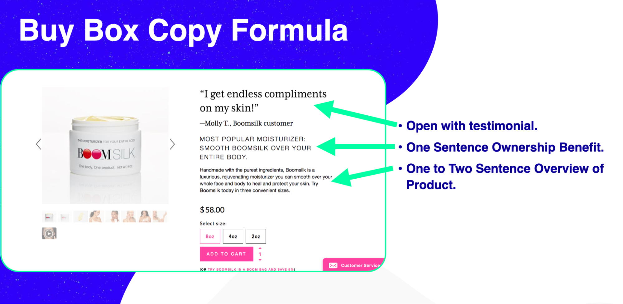
After years of page optimization and dozens of split tests, we came up with this formula for winning buy box copy:
- 1 Sentence Ownership Benefit Statement
- 1–3 Sentence Product Description
Ownership Benefit Statement
The key word here is “benefit”. We’re not focusing on the product’s features or ingredients right now. We’re focusing on how this product will change the customer’s life for the better.
Picture your ideal buyer, and ask yourself: What pain point does my product solve for them? How will their emotional state change after they use it?
Put the answer into one succinct and compelling sentence and stick it in your buy box.
Overview of Product
Here we talk more about product features. What makes the product stand out in your market?
Whether it’s your materials, ingredients, durability or something else, explain why someone would buy your product over the competitions’, and boil it down into 1–2 powerful sentences.
BUY BOX ELEMENT #4
Pricing Info (Try This Split Test)
Pricing — seems straight forward, right?
Sure. But when it comes to product pages, there are always ways to optimize!
One thing that’s helped me develop my winning buy box is that I’m always running split tests.
Discount Split Test: Percentage vs. Dollar Amount
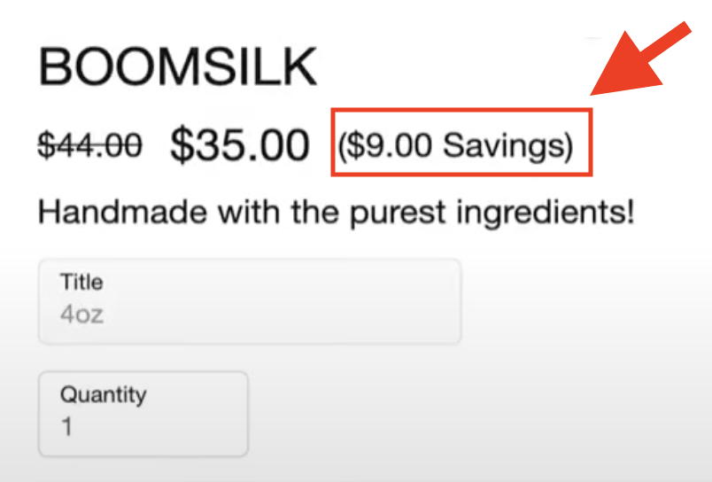
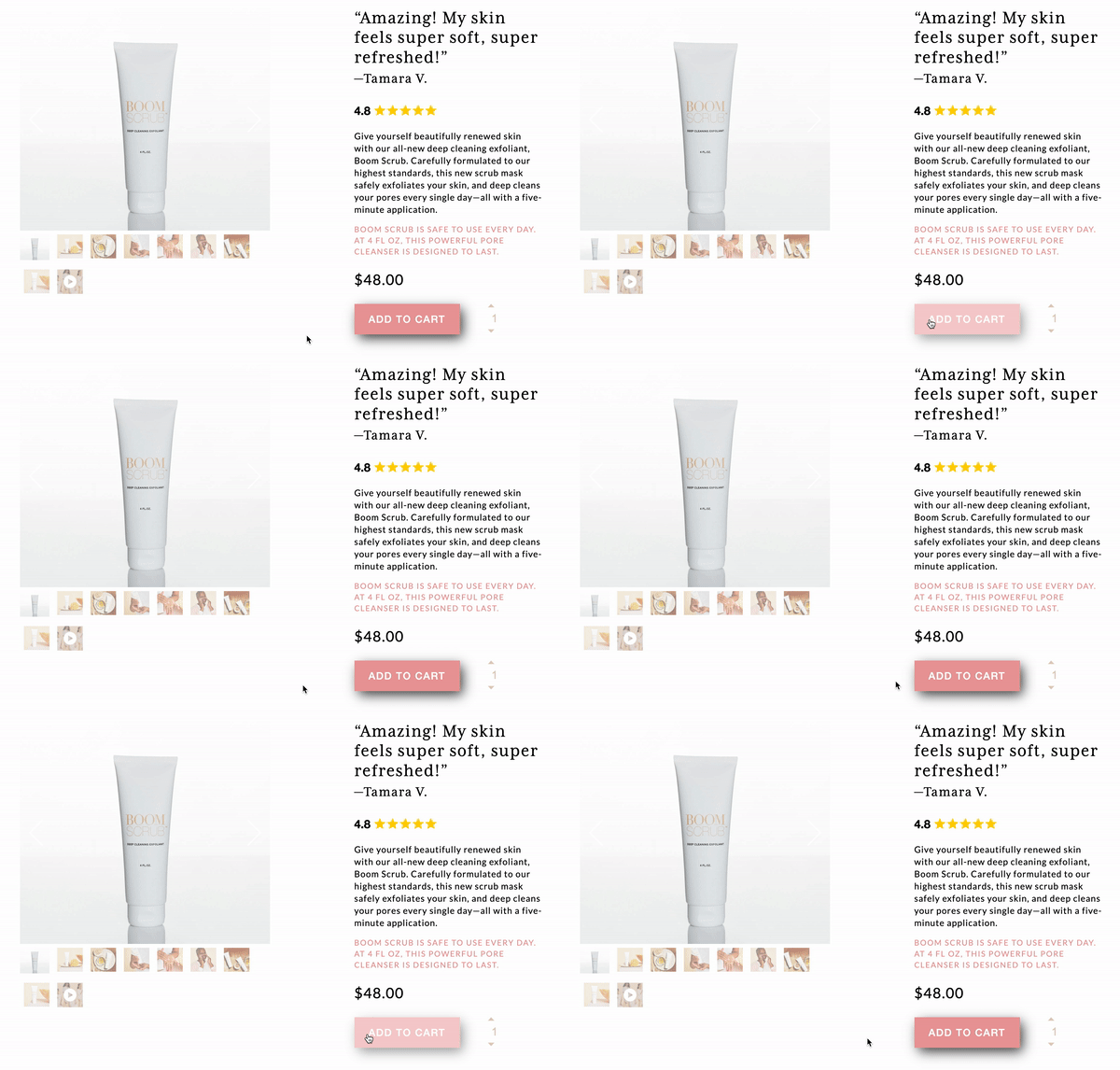
Recently, I ran a split test comparing a dollar amount discount to a percentage amount discount.
I ran this test several times. In the example below, I did a $9 savings (left) vs. 20% savings (right):
Pricing — seems straight forward, right?
Sure. But when it comes to product pages, there are always ways to optimize!
One thing that’s helped me develop my winning buy box is that I’m always running split tests.
Discount Split Test: Percentage vs. Dollar Amount
Recently, I ran a split test comparing a dollar amount discount to a percentage amount discount.
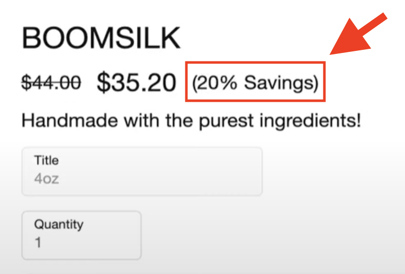
I ran this test several times. In the example below, I did a $9 savings (top) vs. 20% savings (bottom):
These are essentially the same discount, just worded differently. So which offer did better?
Winner: Even though the discount is basically the same, the dollar amount discount was perceived at a higher value — pretty interesting! Even taking the 20¢ price difference into account, the dollar amount variation made 22¢ more per visitor.
Try offering a dollar amount discount during your next sale and see if it impacts conversions.
BUY BOX ELEMENT #5
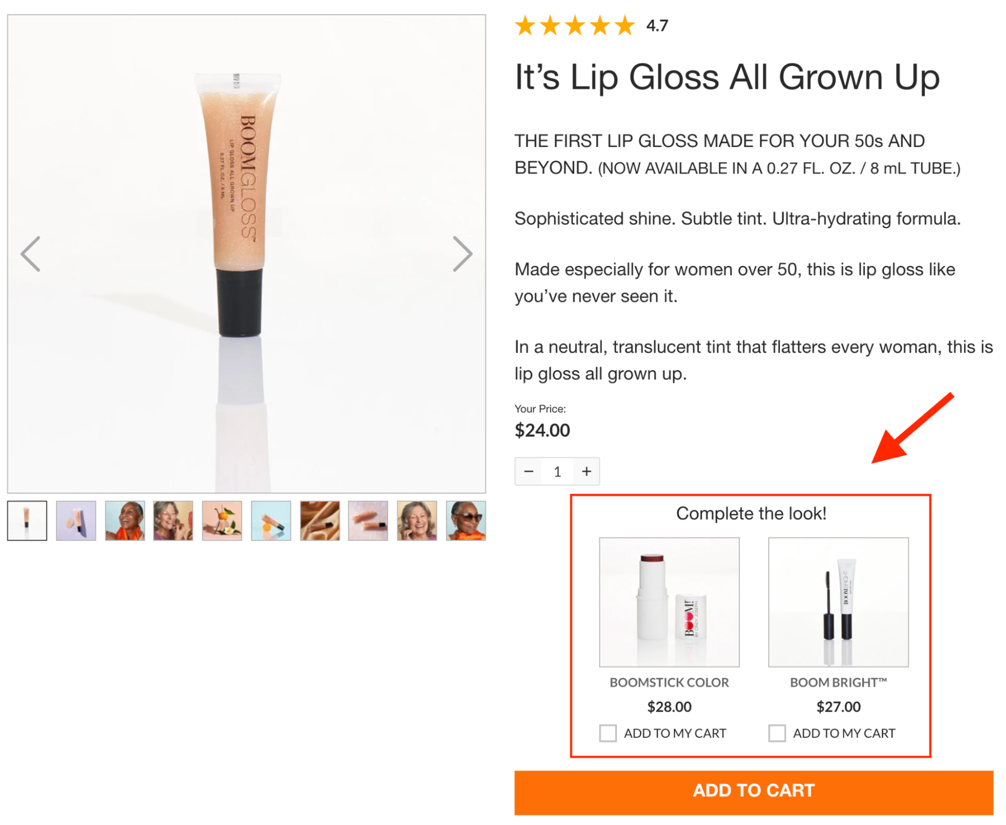
Dynamic Cross-sell
Since 50% of people won’t see beyond your buy box, not only do we want to make this offer as strong as possible, we also want to show as many offers as we can.
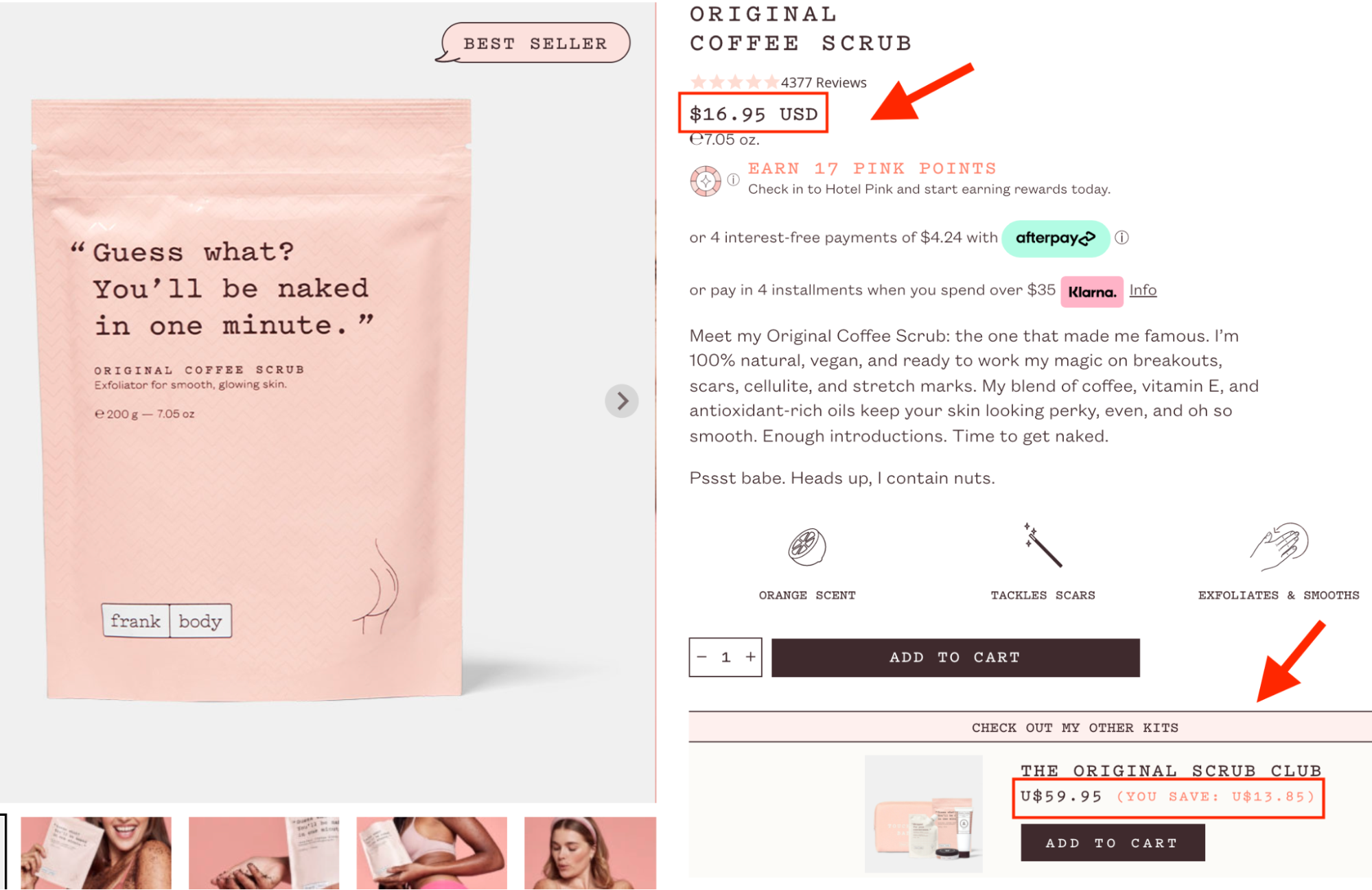
Dynamic cross-sells let you make additional offers right inside the buy box based on things like which product the person is viewing and what else they have in their cart.
Here are some tips for choosing a good cross-sell:
- Complementary Products: Offer something commonly used with the primary product (shirt with a matching hat, shampoo with matching conditioner, etc.)
- Upgrade to Bundle / Kit: Instead of doing individual complementary cross-sells, you can offer multiple items (including the primary product) in a bundle or kit. This is a great way to increase order value!
Can’t offer cross-sells with your Shopify theme?
We have dynamic cross-sells built right into Zipify Pages.
It integrates natively with your store, so it’s easy to offer targeted cross-sells on the product page to increase your conversions and average order value.
BUY BOX ELEMENT #6
Eye-catching & Responsive Call to Action
In your buy box, you want a call-to-action button that stands out and really sells the click.
Here are 2 conversion tips to help you do that:
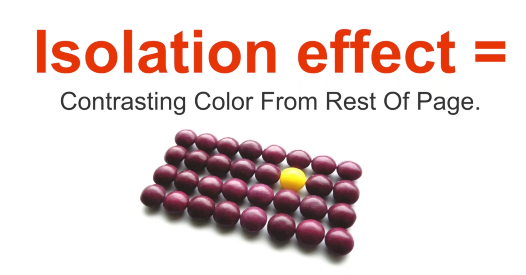
People love to split test one CTA color against another — red vs. blue, green vs. orange, etc. I’ve seen 1,000 of these tests with 1,000 different outcomes. The truth is, no color is more effective than another.
It’s all about context.
If you put a green button on a green-heavy page, it won’t stand out and it won’t convert. But put that same button on a page where it’s the only green element, and voila.
This makes the person more likely to click!
Some of the biggest ecommerce brands have added this feature to their pages, and we include it as an option for all our buttons in Zipify Pages.
BUY BOX ELEMENT #7
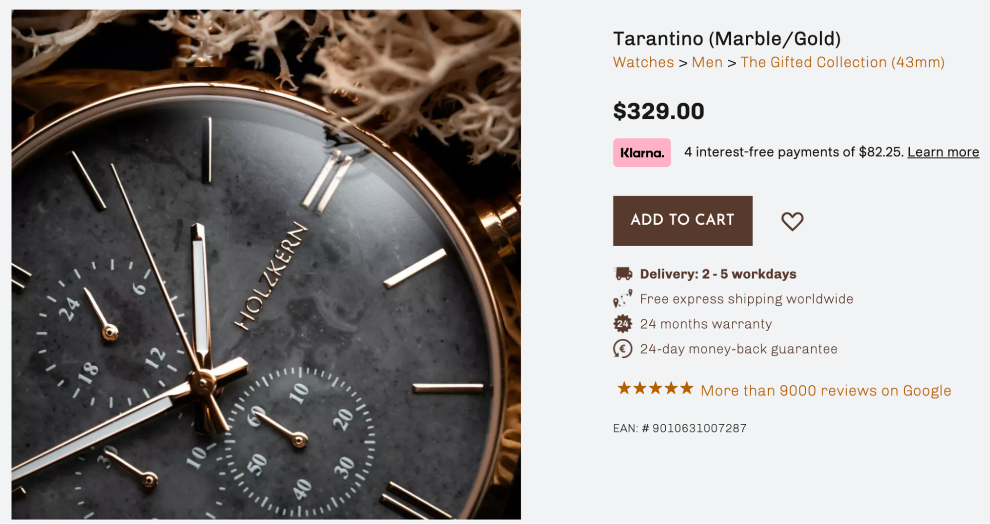
Guarantees & Trust Builders
So far we’ve mainly focused on communicating benefits, which is great.
But we also want to use the buy box to minimize perceived risk and remove friction from the buying process.
Here are 2 elements to help with that:
Guarantees
Remember that when someone buys something from you, they’re taking a bit of a gamble — especially if they’re a first-time customer. They don’t know what the product will look or feel like in person, or if it will provide the benefit you claim.
That’s why it’s so important to remove the customer’s fear right away by including your main guarantee(s) right in the buy box.
In general, nothing beats a money-back guarantee. Shoppers love knowing they will get a refund if they aren’t happy.
You can still have a designated guarantee section further down the page where you explain the details. For now, though, you want a one-line summary of the guarantees you offer on this product.
BUY BOX ELEMENT #8
FAQ Accordion
For our final buy box element, we want to continue to answer questions and remove concerns with an FAQ accordion.
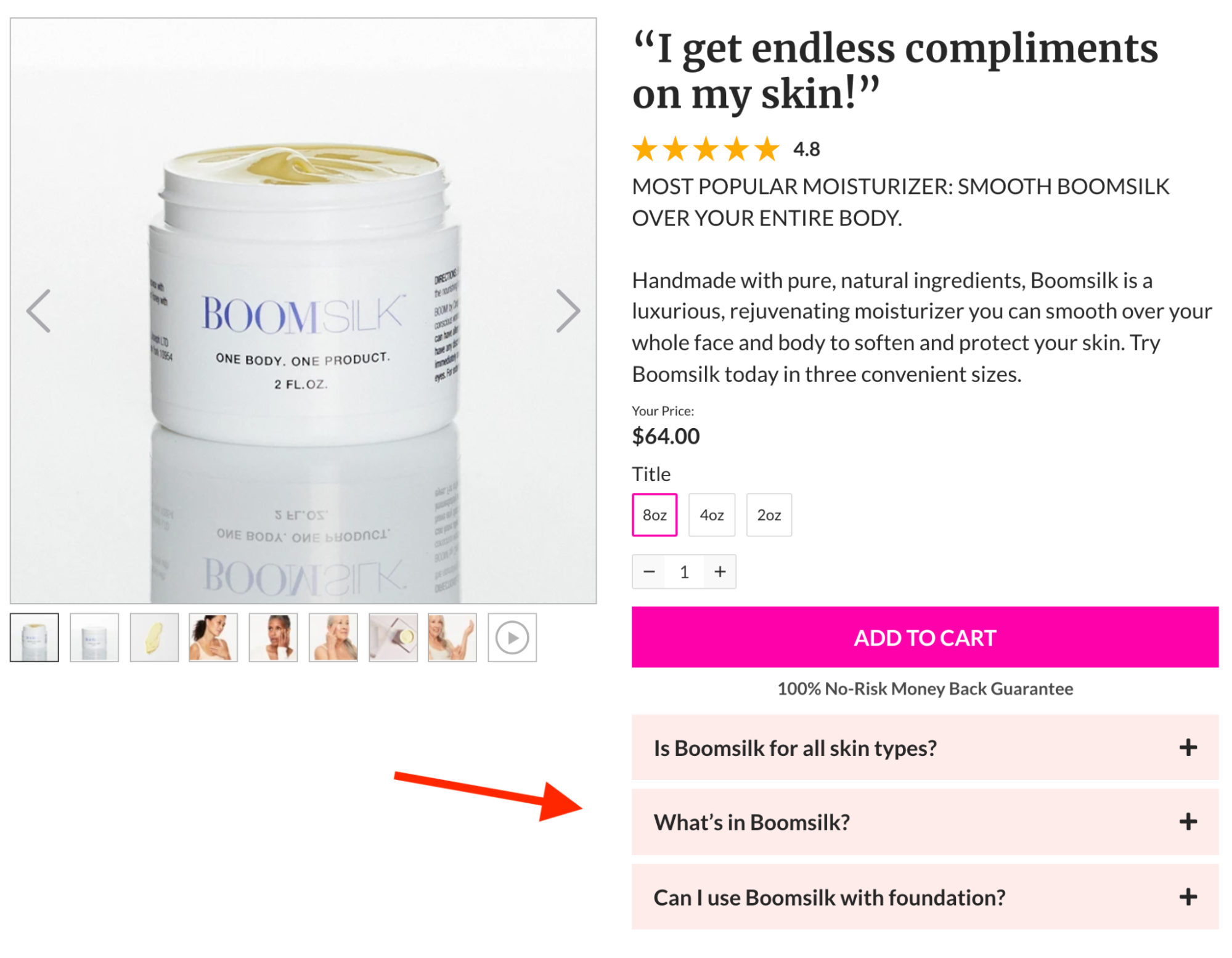
Focus on overcoming the main objections that stand in the way of a sale. On the product page for my moisturizer, I answer who it’s for, what’s in it, and how to use it.
These boxes collapse and expand when a customer clicks on them, so they take up very little space unless someone wants to engage with this page element.
You can even include images in your FAQ accordion!
Note that this is not meant to replace your full FAQ at the bottom of the page, which you should use to answer additional questions.
While not all Shopify themes offer this future, you can add an FAQ accordion to your product pages using Zipify Pages.
Ready to Increase Conversions on Your Shopify Store?
There you have it — those are the 8 elements behind my winning ecommerce buy box.
As I’ve mentioned throughout this article, the easiest way to copy them for your store is to grab my landing page and sales funnel builder, Zipify Pages.
Not only can you use Zipify Pages to improve your product pages, you can also copy entire marketing campaigns — like lead generation, social giveaways, and holiday promotions — taken directly from my $175 Shopify brand…
Or use the drag-and-drop builder to create your own custom layouts, then publish your pages directly onto your store.
(Remember all the split tests I’ve been talking about? That’s because we test all our templates and page elements on our stores before we recommend them for yours!)
And since you publish pages directly onto your Shopify store, there are no plugins and no subdomains, so setup is easy and tracking is even easier...
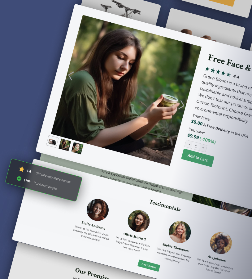
Want an easy way to copy the strategies and landing pages from this training?
There are a number of ways you can implement the strategies from this training and see great results. But if you want to leverage the same tool that I use to create these landing pages for every one of my product launches...
Check out Zipify Pages, my sales funnel and landing page builder for Shopify.
Zipify Pages makes it easy to create high-converting pages for your store. Plus, the app’s template library is loaded with the top-performing templates from my $180 million brand...
So you can easily copy my sales funnels and landing pages to help grow your business.
Free plan available + Try all features with a 14-day free trial.

